Title: Head of Desing and Development
Client: Urban Wizards, 50c
Duration: Sept 2024 - ongoing
Tools: Figma, HTML, CSS, WordPress
Overview of the clents:
the world’s largest in-person Harry Potter meetup group. They have over 4,000 members and hold events threw out the Metro of New York City.
Develop a site for Oct 2024 to sell tickets for the retreat.
Review the sites UI update the color palette, and build a more user freindly regestration page and over all imrpove the sites User experince.
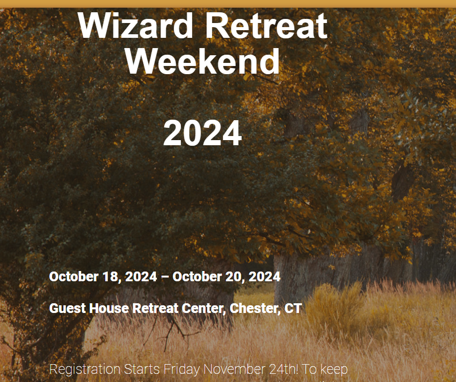
Review the site from the pirior event and look for ways to improve the overall user exerpince
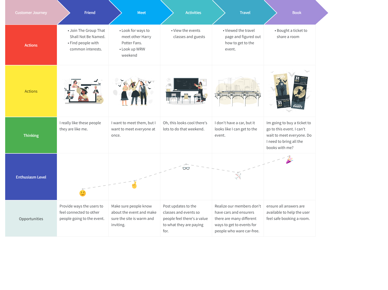
Using data from other events I was able to make a user Persona with many years of experince working with this population
Name: Meg
Age: 27
Job: Teacher
Location: New York City
Goals: Meet people they have things in common with
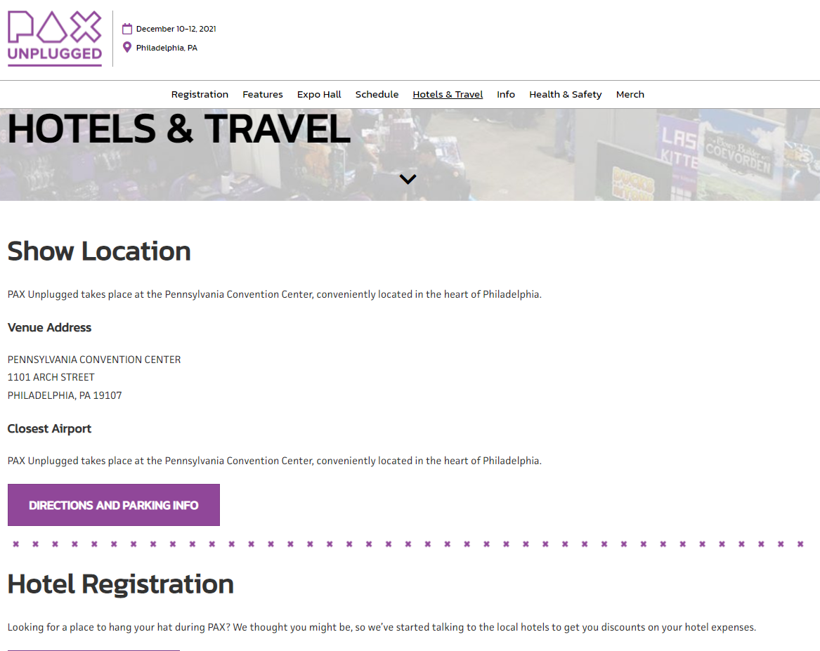
Needs: To be able to get to the event without a car
Pain Points: Wants to know if it's worth the cost
Habits: YAI book reader and often sews or makes there cosplays by hand
Since Harry Potter Fans who are adults and well travel for a weekend
to go to Harry Potter Themed actives for 3 days is a pretty nict group.
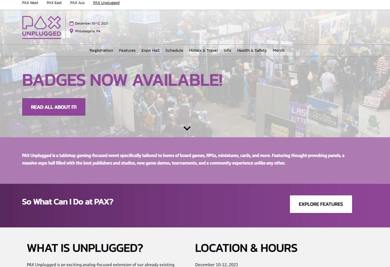
I only reviewed Pax unplugged its' also a fairly nitch group as well.
Pax Unplugged is ran by Reed Pop who runs large Cons such as New York Comic Con with 100k guests and Pax East and West both have large attenince Pax unplugged is a game board event with a lower population.
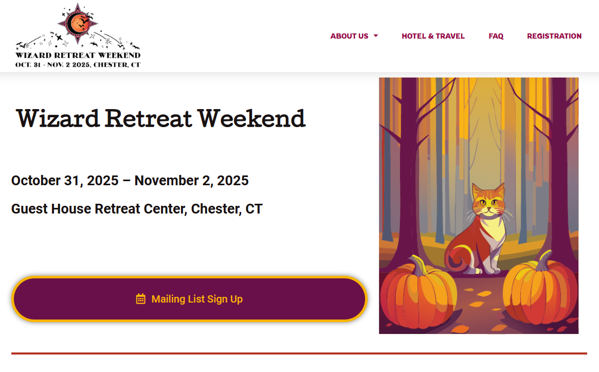
The Home Page for the Site giving information the guests would need and updated as the event gets closer
Reviewing the way of the the user this was the first large eventing people could attent after Covid many had meet online and would be able to meet in person for the first time. selling the user that they would have a good time and finally get to see each other again would be worth the travel.
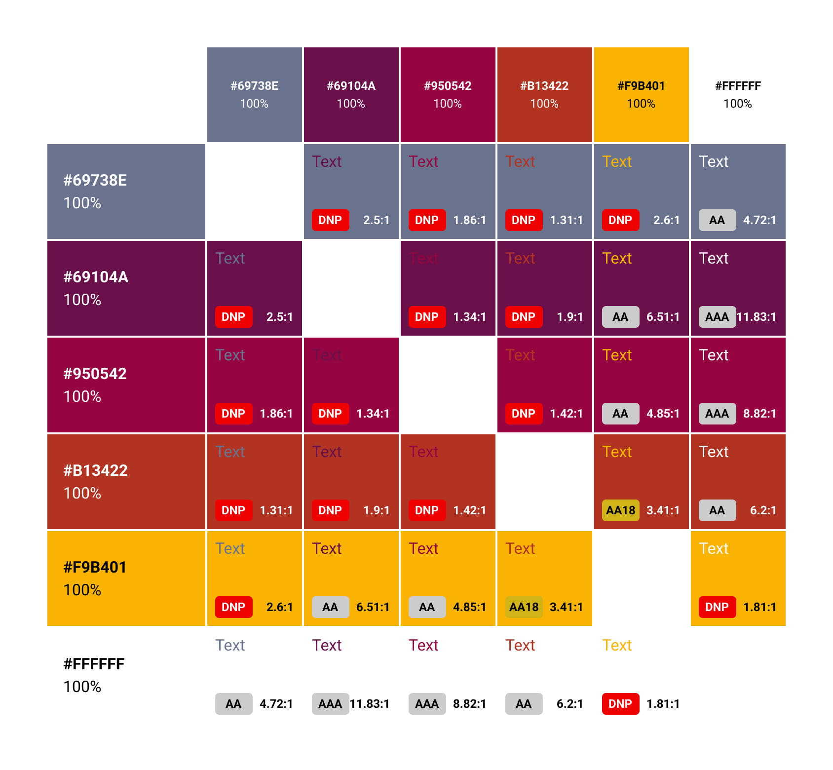
Last time I built out the site I only had 2 weeks to develope a plate and build out the site this time I had much more time. I wanted to build a bright palet that felt more like fall but also avoid the Harry Potter house colors. So no green, navy blue, red, and yellow.
Even though I love these color I had to ensure everyone would be able to see them clearly
The old site felt heavy and over done and hard to read is some areas.
I wanted to insure the site was easy to read, and focus on User Needs and goals. for the landing page its signing up for the mailing list. I know better to avoid putting text over a imange but I had to add a cat.